Create Your First Project
Start adding your projects to your portfolio. Click on "Manage Projects" to get started
WHEEL of FORTUNE
Project type
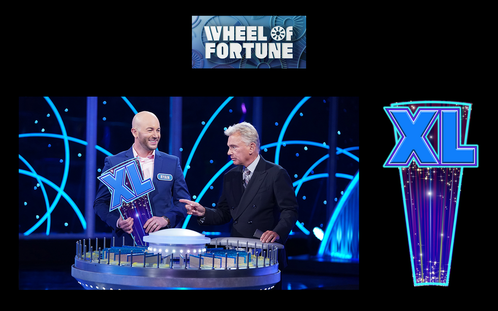
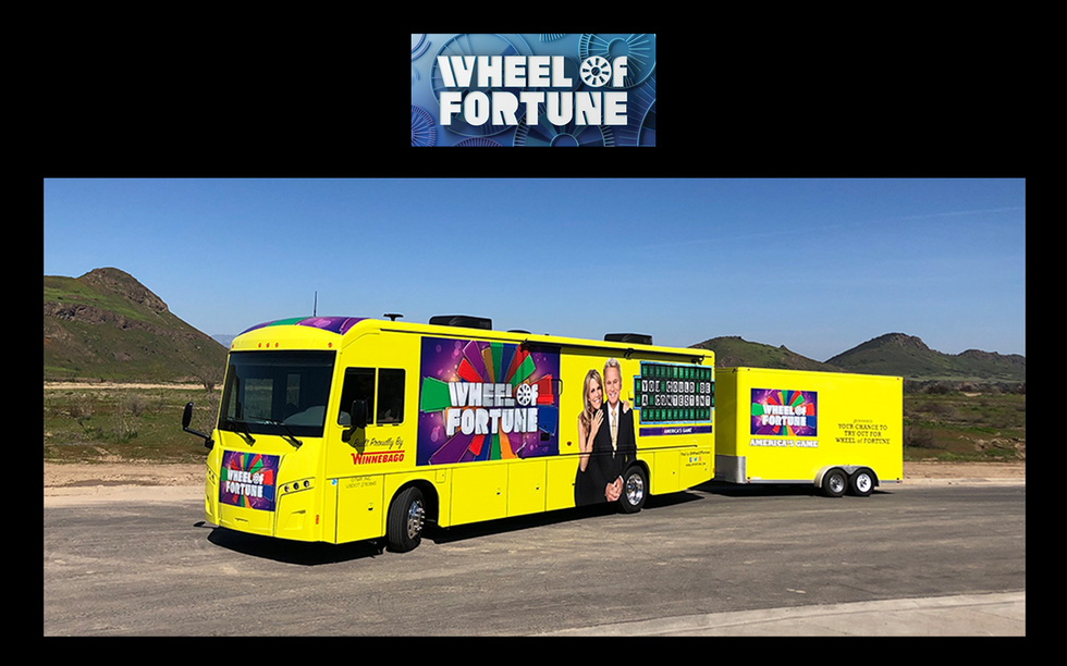
Logos, Wedges, Style Guides, Wayfinding, Prize Envelopes and other Graphic elements
Location
Los Angeles
Role
Design Director, Designer and Production Artist
Link
Output
Concept,
Graphic Art,
Identity,
Collateral,
Photography,
Illustration,
Production & Scenic Art
What keeps this Wheel of Fortune turning and what I am responsible for:
Color Palette: Bold, saturated colors are key. They need to be television-friendly, popping under the lights and conveying excitement. Think about how the color blocks create a dynamic visual rhythm as the wheel spins.
Typography: Clear, legible fonts are crucial for the dollar amounts and prizes. They need to be readable from a distance and on-screen. The style often leans towards a classic, slightly celebratory feel.
Movement and Light: The way the wheel catches the light as it spins is essential. The clicks and the final stop create a dramatic moment. We'd be considering the reflective qualities of the materials and the strategic placement of lighting to enhance this.
Branding Integration: Subtle but effective placement of the show's logo and any sponsor integrations needs to feel natural and not detract from the gameplay.
Background and Contrast: The background of the puzzle board needs to provide sufficient contrast with the letters to ensure readability.


